

We live in a data-driven world. Organizations across industries rely on data to drive strategic decisions and gain competitive advantages. Making sense of complex data requires powerful yet accessible tools that can transform raw statistics into compelling insights. This is where Tableau comes in.
Tableau has emerged as one of the most popular business intelligence and visualization platforms, empowering anyone to analyze and present data impactfully. With an intuitive drag-and-drop interface, Tableau makes data analytics accessible to professionals across functional domains, not just data scientists.
This beginner’s guide will take you through an easy, 6-step approach to learning Tableau in 2024, unraveling the fundamentals while overcoming common roadblocks. Continue reading to discover what makes Tableau an indispensable skill and how you can go from a complete novice to a confident data storyteller, unlocking practical value at your workplace.
What is Tableau?

Tableau is a popular data visualization and business intelligence software that helps people transform complex data into easy-to-understand visuals and dashboards. The software provides an intuitive drag-and-drop interface that allows anyone to analyze and visualize data without needing coding knowledge.
Tableau connects directly to various data sources like Excel, databases, cloud services, etc. It quickly processes large volumes of data and translates them into interactive charts, graphs, maps, and dashboards. These visualizations help businesses gain data-driven insights for strategic decision-making.
Key Features of Tableau:
- Data Connectivity: Seamlessly connects to diverse data sources, including Excel, CSV files, cloud databases, data warehouses, etc. Provides live queries or in-memory data extracts for flexibility.
- Data Blending: Analyze data from multiple disconnected sources by blending data at a visual level without transformations. Reveals insights not possible originally.
- Interactive Visualizations: Drag and drop interface to create customized reports, dashboards, and stories with interactive features like filters, tooltips, and drill-downs that simplify data analysis.
- Smart Analytics: Inbuilt artificial intelligence assists with trend analysis, statistical insights, forecasting, clustering, and anomaly detection to guide analytical thinking.
- Collaboration: Share visualizations, customize permissions, and enable commenting for simplified collaboration on data analytics and presentation.
- Cross-platform Accessibility: Cloud environment enables universal access from desktop, tablet, and mobile devices so stakeholders can stay connected to data visuals from anywhere.
In summary, Tableau augments human intelligence around data analysis through intuitive visual interactions – helping anyone across functions, skill levels, and devices gain and share critical insights faster for overall enhanced business decision-making.
Why Learn Tableau?
Before diving into the learning journey, it’s important to appreciate why Tableau skills offer immense value in driving data-driven decision-making. Here are some compelling reasons to invest in learning Tableau:
- Democratizes Data Analytics: Tableau’s legendary ease of use makes advanced analytics accessible without coding, empowering functions beyond IT to leverage data. With minimal training, anyone can connect, prepare, analyze, and visualize data in minutes with Tableau.
- Wide Enterprise Adoption: According to Gartner’s 2022 survey, Tableau leads the business intelligence software market with 66% brand presence across global organizations. It’s the industry standard for augmented analytics and data visualization.
- Multiplies Individual Productivity: Tableau accelerates insight discovery through rapid analysis, saving significant time over traditional spreadsheet software. Analysts become far more productive when leveraging Tableau’s extensive analytics capabilities.
- Facilitates Data-driven Culture: Tableau not only supports analysts but also aids data-driven collaboration across the business via highly interactive dashboards assembled from diverse data sources – enabling more informed decisions.
- High Job Demand: As organizations scramble to monetize data, Tableau experts who can tame and present information effectively are in hot demand with high compensation. Forrester predicts enterprise spending on BI software like Tableau will grow at 14% annually. Job postings for Tableau on LinkedIn have increased by over 45% annually lately.
With a strong enterprise reliance on converting raw data into value through deeper intelligence, Tableau skills offer tremendous commercial and personal benefits.
How to Learn Tableau Step-By-Step?
Let’s now get started on the step-by-step learning path to gain expertise in this space.
Step 1: Understanding Tableau Basics
Like any new skill, laying a proper foundation proves critical for efficiently picking up Tableau. Before rushing into advanced analytics, it’s vital to clarify some basic concepts about Tableau workflows and key terminology.
What does Tableau do?
In a nutshell, Tableau provides interactive options to connect diverse data, manipulate information, discover patterns, and clarify findings visually. This enhances understanding of statistics for smarter decisions compared to traditional reporting software. Let’s break this down:
- Data Connectivity: Seamless access to varied data sources – csv, excel, databases, etc.
- Data Preparation: Intuitive options to clean, transform, and structure data
- Data Exploration: Instant analytics via charts, custom calculations, and trend analysis
- Data Storytelling: Impactful communication of insights through dashboards and presentations
Understanding these core aspects frames realistic expectations of Tableau functionality. Now let’s demystify some common data analysis terms used in Tableau:
Key Data Analysis Concepts
- Dimensions – Qualitative attributes like customer names or product categories used to group data points
- Measures – Quantitative metrics like sales amounts or profit that get statistically measured
- Data Granularity – The level of detail data gets aggregated at (daily, monthly, etc.)
- Trends – Systematic upward or downward shifts in measures over time
- Outliers – Extreme values deviating from expected data patterns
- Context – External factors qualifying the data, like sales seasonality
With basic clarity on common data concepts, let’s prep Tableau Desktop – the tool that enables the entire analysis process.
Step 2: Setup and Navigation
Getting your desktop ready with the appropriate Tableau version ensures a smooth experience. The 14-day full trial is enough to start practicing core skills. Here are the ideal computer configuration recommendations:
- PC Requirements: 64-bit Windows 10 or later version, 8+ GB RAM, 10GB storage space
- Mac Requirements: 64-bit MacOS 10.15 or higher, 8+ GB RAM, 10 GB storage
While the web-based Tableau Online option exists for cloud collaboration, Tableau Desktop enables richer functionality for comprehensive analysis.
- Easy Navigation – Once setup is completed, exploring the elegantly designed Desktop screens builds familiarity:
- Home Screen – Manage data connections, open recent workbooks & tweak settings
- Data Source Page – Connect to Excel, CSVs, databases, etc.
- Analytics Workspace – Core analysis with tools to visualize data
- Dashboards – Curate stories by assembling visualizations
- Stories – Guide narrative walkthroughs explaining data insights
- Web Authoring – Publish content online for sharing
Poke around these views to understand the end-to-end workflow from data connectivity to web publishing. Also, glance through the intuitive Show Me function with sample data to experience smart chart recommendations based on the metrics used.
Step 3: Visualization Fundamentals
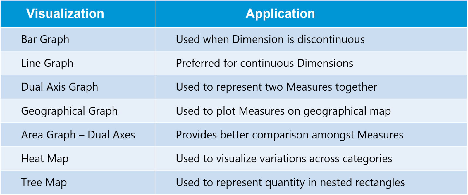
At its heart, Tableau focuses on interactive data visualization for enhanced clarity. However, not all chart types effectively highlight key data aspects. Choosing the right visual becomes vital to truthful data representation. Let’s walk through popular visualization formats:
- Charts: Compare measures like sales based on dimensions like years with intuitive drag-and-drop charts like bars, lines, or pie sections:
- Bar & Column Charts: Column bars are arranged vertically; Bar charts are arranged horizontally
- Line Charts: Display measure trends over time, intervals, or categories
- Pie Charts: Show measure contributions to a total value
- Scatter Plots: Relate measures through 2-D scatter points to assess correlations
- Heat Maps: Use color gradients to visualize data density or intensity
- Maps: Encode your data geographically using automatic latitude/longitude detection
- Dual Axis Charts: Blend separate measures (like sales and profits) onto shared axes
- Tree Maps: Display hierarchical data using nested rectangular sections
- Box & Whisker Plots: Highlight statistical distribution including outliers
As you start constructing basic charts, explore options within each viz type to enhance clarity. Customize colors, labels, tooltips, formatting, sorting, etc. Play around with sample Superstore or Movie data to quickly gain comfort.
Step 4: Interactive Dashboards
While individual charts provide visibility into specific data facets, Dashboards assemble visualizations and supporting elements logically to convey the full picture. Learning dashboard best practices catalyze effective storytelling.
Streamline Layout
Carefully curate key viz components in an intuitive manner, respecting the space constraints of underlying devices. Group related data chunks in consistent grid structures for natural flow.
Simplify Navigation
Use interactive slicers, menus, and buttons allowing consumers to filter on demand without scrolling through the full dashboard. Minimize clicks to access desired insights.
Spotlight Key Metrics
Utilize KPIs, synoptic visuals, alerts, and reference lines guiding attention to the most critical insights directly tied to audience goals right upfront without searching.
Maintain Context
Surround viz components with legends conveying units of measurement, data time range, custom calculations used, etc, to prevent misleading interpretations.
While constructing dashboards, continually evaluate if layout structures lead viewers logically from macro trends to micro explanations in a contextualized, trustworthy manner.
Step 5: Master Advanced Analytics
Now that foundational understanding takes shape, exploring more advanced analysis and calculation techniques unlocks greater insight potential from Tableau leveraging:
Statistical Analysis
Incorporate statistical measures like standard deviation, regression, correlation analysis, confidence intervals, significance testing, and custom distributions into your data calculations for increased analytical depth.
Advanced Chart Types
Gluon allows Tableau integration with Python and R, offering sophisticated viz options like dendrograms, Sankey diagrams, chord graphs, and network graphs to uncover hidden data dimensions.
Custom Calculations
Create sophisticated custom metrics using Tableau’s formula language to manipulate existing fields, solving unique business challenges. Allows immense flexibility.
Data Modeling
Efficiently structure data for usability and performance through best practice modeling techniques like star schemas, surrogate keys, hierarchies, groups, and sets.
Performance Optimization
Boost speed by strategically leveraging Tableau extract files, efficient data connections, indexing, data densification, query optimizations, and result caching.
Step 6: Expand Knowledge Horizon
Completing the above milestone strengthens your Tableau core expertise. However, the learning journey continues as new functionality is added periodically. Staying updated ensures you always get the best ROI from Tableau’s capabilities.
- Extensions & Add-Ons: New extensions like clustering, forecasting, anomaly detection, and data validation boost analysis needs without switching platforms
- Tableau Conference: The annual Tableau Conference covers the latest trends, case studies, expert techniques, and roadmap sessions to expand knowledge frontiers
- Tableau Blog & Forums: Regularly review latest blog posts and participate in community forum discussions to continuously level up through peer insights
- Industry Applications: Each sector leverages Tableau uniquely. Follow experts who share vertical-specific content around use cases in your domains, including healthcare, retail, finance, etc., to maximize the relevance of skills.
- Certifications: Consider formal Tableau training programs offered by Tableau and other education partners culminating in Desktop or Server certification exams to validate and endorse the expertise
Staying abreast of platform enhancements through these channels amplifies capabilities over time in a scalable way.
Getting Over Learning Roadblocks
While this structured curriculum demystifies Tableau in a phased manner, some common hurdles can temporarily impede learning for new users. Being aware of them is the first step towards overcoming these challenges:
- Intimidating Data Prep: Data preparation proves daunting without context on expected cleanliness standards or reshaping techniques. Tableau Prep simplifies dataset structuring rapidly.
- Complex Calculations: Myriad calculation options confuse new users when constructing the right formulas to solve analysis needs. Start with basic arithmetic operations and incrementally incorporate other functions through online lookups and forums.
- Choice Paralysis on Visuals: With almost endless customization around designing visualizations, landing on the most effective chart to clearly represent key data facets seems challenging initially. Follow visual best practices catalogs to amplify clarity.
- Dashboard Information Overload: Determining relevant info to showcase on dashboards without causing data clutter requires practice. Apply minimalism principles highlighting only crucial data at the optimal granularity.
- Collaboration Uncertainty: Maximizing team collaboration functionality around cloud publishing, permissions, and commenting protocols warrants familiarity with fundamentals first.
Be patient through the initial learning phases as the vital foundational understanding takes root. Trust the process. Over time and some hands-on practice, everything starts gelling together. Soon, you’ll be transforming raw data into remarkable visual insights faster than imagined! Tableau speeds up exponentially with proficiency.
Additional Resources
For anyone motivated to extract more value from data through deeper analytical insights using Tableau, here are some additional handy resources worth checking out:
- DataCamp: Interactive Tableau courses structured for beginners help efficiently gain proficiency through hands-on exercises based on real-life data. Gamification keeps things interesting, while clarity on complex topics simplifies things for new users.
- Tableau Community Forums: Peer forums are used to gain practical tips from experienced Tableau users, discover solutions for vexing problems, and stay updated on emerging best practices. Great knowledge exchange platform.
- Viz of the Day: Tableau’s Viz of the Day newsletter shares innovative sample visualizations created by experts worldwide who deliver daily inspiration on new design approaches to experiment with.
- Data + Women Events: Tableau users frequently organize free virtual meetups, creating supportive communities for women from diverse backgrounds looking to enter and grow in data careers with learning resources and mentoring opportunities.
Conclusion
Tableau offers immense capability to help enterprises, large and small, better leverage data to carve competitive advantages and improve performance. This pragmatic guide offers a phased methodology tailored for beginners to gain competence through step-by-step milestones.
Within just 24 hours of hands-on practice across 6 intuitive courses, you can gain job-ready Tableau skills to analyze, visualize, and share data impactfully. The vast Tableau community also assures you of continual support for lifelong learning aligned with your career goals.
Fast forward a couple of years from now. Where would you want your Tableau skills to reach through consistent practice? Perhaps leading strategic business decisions through data-driven insights? Or even advance to trainer roles to evangelize data capabilities enterprise-wide?
CCS Learning Academy offers comprehensive Tableau training programs covering beginner, intermediate, and advanced level concepts. The expert instructors simplify complex analysis techniques through hands-on demos tailored for workplace success. Check out the tailored Tableau courses at CCS Learning Academy to visualize those aspirational endpoints and work backward. This ultra-accessible tool awaits your data storytelling ideas through visually engaging narratives – the most compelling way to convert raw statistics into informed action.