
In today’s data-driven world, the ability to effectively visualize and communicate information is paramount. As we head into 2024, the landscape of data visualization tools has evolved, offering more sophisticated, user-friendly, and powerful options than ever before. These tools are essential for analysts, marketers, and decision-makers across industries, enabling them to uncover insights from complex datasets and make informed decisions.
In this blog post, we’ll explore the best data visualization tools for 2024, highlighting their unique features, strengths, and how they can help transform your data into actionable intelligence.
What is Data Visualization?
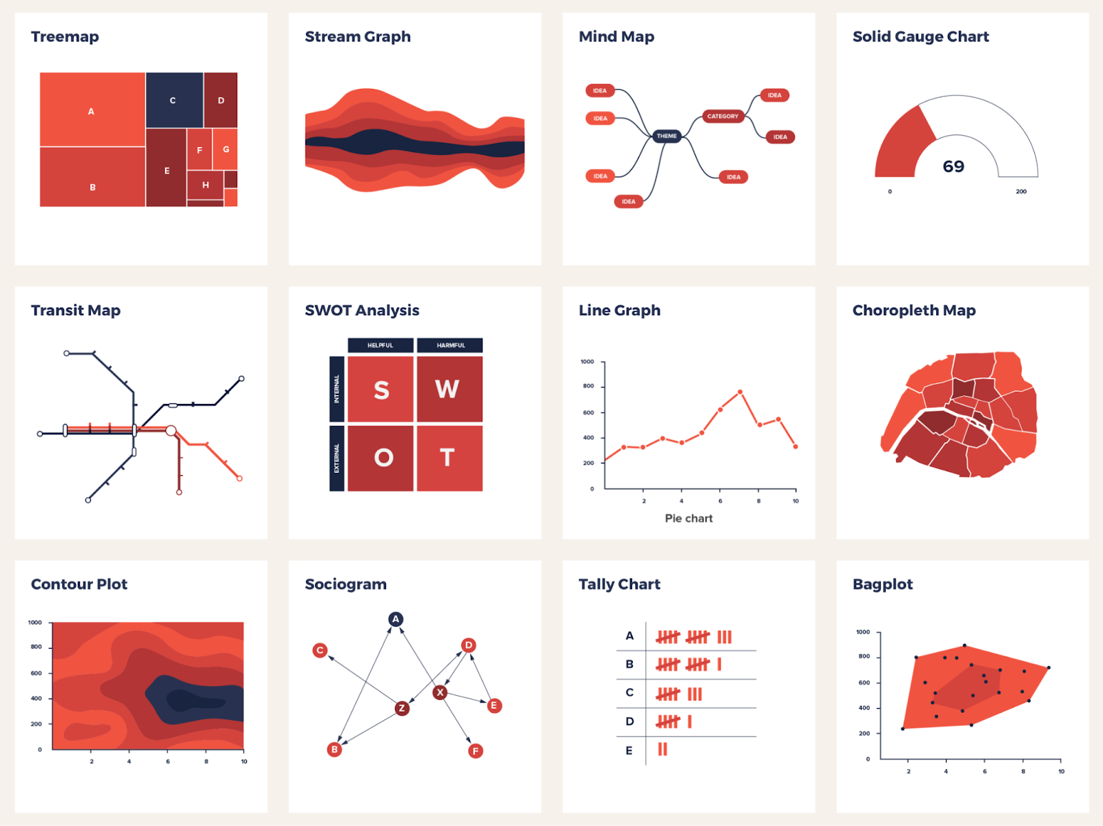
Data visualization is the process of graphical representation of data. The representation includes geographical maps, sparklines, statistical graphs, infographics, and charts. The data sets are represented through various visual elements that are easily understandable. Representing those data in graphics can help in the extraction of actionable insights that further can be used in important decision-making.

Various data visualization tools facilitate AI integration, collaboration, data interaction, and exploration. They support streamlining data visibility and usability. Thus, visualizing data helps in understanding hidden patterns and layers of data.
Why is Data Visualization Important?
The visualization of data represents the hidden insights and anomalies. Data visualization allows you to reveal hidden facts and empower the strength of data by using them in making strategic decisions. Empowering data in visual formats leads to more focused insights. The effectiveness of data visualization increases when the complexities are sorted easily and tools for rendering data are used economically. You can learn these concepts with CCSLA courses like analyzing and visualizing data using Tableau.
What are Data Visualization Tools?
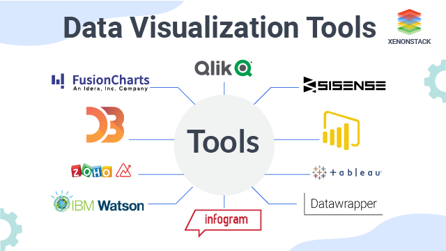
There are numerous data visualization tools that companies and firms should use to derive meaningful information through data. Tools like Tableau, Power BI, Qilk Sense, Domo, Looker, Sisense, etc., help to plot data derivations into visual formats like charts, graphs, infographics, and many more. These visual formats reduce the data complications and enhance the derivation insights.
The interface and database connections help to create visual data models and statistical analysis. These tools support a variety of visual styles that enable you to visualize data. A data visualization tool lets you input datasets and automatically alter their graphics. Most templates are built to visualize data and handle large chunks of data. The tools are easy to use and have a user-friendly interface. It is simple to handle and prepare graphs and charts.
Benefits of Using Data Visualization Tools
Data visualization tools offer various benefits to users. It enables you to simplify data communication and interpret information for clients, stakeholders, and colleagues. Data visualization tools help many firms to deal with their new audience and various important clients. The attractive and interactive data presentation gives a new layout to enhance the impression of the firm.
Using data visualization tools for different purposes is a good choice, as it offers numerous advantages, such as:
Improved Data Comprehension
Data visualization allows you to create charts, maps, and graphs. The visual information improves the data interpretation. It helps you understand data easily and lets you grasp the patterns, trends, and relationships. With data visualization, trends and relationships can be established easily.
Enhanced Decision-Making
Data visualization helps you to identify insights quickly. Relevant trends and patterns can be built for more informed decisions. Visualizing data can maintain anomalies and correlations and spot outliers. It impacts the firm’s decision-making process. The data-driven decisions are formulated with the driven insights, which are then used in the operations of businesses.
Effective Communication Channel
Establishing effective communication channels is very necessary nowadays. For implementing data-driven insights, conveying and engaging with consumers properly is important. Better communication is required while presenting data to colleagues, clients, or stakeholders. Thus, with data visualization tools, people can present their data in a modified form, which allows the audience to understand the message instantly. This also creates an engaging environment and automates the process of representation.
Provides Data Exploration Feature
Interactive features are provided in several data visualization tools. Such features help you to filter and drill down the data. They allow you to explore data in-depth by filtering out data and changing the visualization process. This helps to enable a deeper understanding of information and messages.
Time and Cost Savings
Tools help in the automation of the visualization process. They allow you to save valuable time and resources. With a better interface and intuitive templates, many operations of a business can be efficiently handled. Not only time but also cost is minimized by increasing performance effectiveness.
7 Best Data Visualization Tools
Many data visualization tools offer various benefits to the users. Companies use such tools to increase the performance and analytical ability of their business. Such tools have core features that enable users to enhance their experience and the effectiveness of their business operations.
Here is the updated list of the top 7 data visualization tools:
1. Tableau
Tableau is a tool data analysts, statisticians, and scientists use to visualize data and get better insights. This tool is famous for producing the required output instantly. Tableau helps to prepare, clean, and format data. With such tools, data visualization processes become far more efficient.
It serves as a platform for data infrastructure and business intelligence. It helps to solve large datasets with complex issues. The tool offers 14-day free trials to the users. Enroll for the CCSLA course Tableau Desktop Level 1: Introduction for Novice Users for a better experience.
Core Features
- Data connection and import: This tool has better connection and integration capability. It lets you connect data sources like databases, cloud services, and spreadsheets. The transformation and data import become easy with this tool.
- Data visualization templates: These include various data visualization templates like bar charts, scatter plots, pie charts, maps, etc.
- Data blending: Tableau helps to blend data from different data sources and merge them. This is helpful when you are dealing with huge datasets.
- Dashboard creation: This feature helps to combine different visualizations into dashboards. This provides a comprehensive view of all data.
2. Power BI
Microsoft developed this tool, and it integrated it with all Microsoft products. It provides various visualization options, from basic charts to advanced visuals. Power BI also supports data modeling, and several companies rely on it to create intuitive interfaces and better decision-making processes.
Core Features
- Data modeling: Various tools can be integrated to establish relationships among your data and calculate measures using techniques like DAX.
- Alteration analysis: Power BI tools like Power Query and Power Pivot provide you with the correct explanation for any change or alteration in values.
- Interactive dashboards and reports: This feature allows you to build better dashboards and reports to help users understand easily.
- Visualizations: Includes various options like charts, graphs, and maps. It helps you customize visuals using Power BI’s custom visuals SDK.
3. Sisense
Sisense is one of the famous data visualization tools that extracts data from various sources and creates insights based on those data. This tool is known to have embedded analytical capabilities that make it different from the rest of the tools.
This tool also allows users to do open-source integration and gain access to RestAPI from their interface. However, one needs to get extensive training to operate this software. Setting up data cubes is a bit complex in this tool.
Core Features
- Ad-hoc analysis: This feature allows users to explore tons of data, create reports based on them, and visualize the data collected without specialized technical knowledge.
- Data visualization – This feature offers various options to represent the data in graphs, dashboards, or charts.
- Data integration: With Sisense, you can connect different data sources, which includes integration from cloud services, databases, and spreadsheets that are to be used to keep all the data in one place, and you can analyze data.
- Data modeling: This feature helps you make your data more coherent and present it in a readable format. You can do data cleansing and make relations between data for better analysis.
4. Domo
Domo is a tool that helps you analyze data and shares insights that can be used further for decision-making. This tool offers support across all the personas. However, this tool is primarily made for analysts; nowadays, it has been increasingly used by developers and designers.
Core Features
- AI integration: With Domo, you can deploy Domo-hosted models, which can be from AutoML or Jupyter Workspaces. These models can also be from OpenAI, Hugging Face, and other AI platforms and can be easily managed by AI.
- Customizable dashboards: Domo allows users to build customizable dashboards that can be used to display reports and visually represent the data. A user without technical knowledge can easily operate, customize, and apply various layouts, annotations, and filters to these dashboards.
- Data modeling: This tool has a drag-and-drop interface, which can be used to arrange and organize data models from various sources.
- Data visualization: Domo has various charts and customizable maps that can be used to visually represent data and create engaging dashboards.
5. Zoho Analytics
Zoho analytics is a tool that assists you with data preparation, exploration, and visualization of data in various forms. You can use different analytics solutions to track various performance metrics, make forecasts, and make predictions about data. Furthermore, this is one of the few data visualization tools with AI integration that can help you create data sheets and convert them into a readable format using various pre-built templates.
Core Features
- Augmented analytics: Users can gain insights and recommendations on ML, AI, and NPL technologies. This helps users perform predictive analysis of the data and perform various what-if analyses. Furthermore, this helps them predict trends that may take place in the future based on their analysis of the data.
- Visualizing data: The tool is ideal for creating charts, dashboards, graphs, and pivot tables, which can be used to visualize the collected data. Moreover, this tool has an excellent low-code interface, allowing beginners to operate seamlessly.
- Data preparation: This feature allows users to transform and enrich the available data easily. After this, they can easily merge the different data sets and perform calculations or analyze them based on different metrics.
- Data integration: This feature allows users to import data from different applications and platforms and integrate them on one platform.
6. Looker
This is one of the data visualization tools that Google developed. It is a self-service analytics platform that allows users to make data reports and create engaging dashboards. With this tool, you can integrate your data with an open source using the Google Cloud platform. The data processing capabilities of this tool can be easily augmented using AutoML, BigQuery ML, and Vertex AI.
Core Features
- Self-service: Looker is one of the few data visualization tools that allows users to create customized data models, define metrics, and transform them into dashboards and reports.
- Real-time data analysis: Real-time data analysis is a unique feature of Looker, allowing you to gain real-time insights on data from any cloud you choose. You also get an option to refine the data yourself.
- Ad-hoc reporting: This feature of Looker helps users detect anomalies in their data.
7. Qlik Sense
Qlik Sense is a data analytics tool that is used by businesses to explore their data better. This tool has advanced analytics capabilities that increase efficiency multifold, and it can also be deployed on any premise or in the cloud. Its capability to manage different data sources and embed them flexibly makes it a unique platform.
Core Features
- Hybrid deployment: The tool establishes connections with various sources, including public or private cloud or any on-premise site.
- Real-time data analysis: Qlik Sense allows users to use trigger automation, data monitoring, and alerts to analyze data in real time.
- Comprehensive data: Qlik Sense helps users refine the data and visualize it.
Factors to Consider Before Choosing Data Visualization Tools
Before choosing or finalizing any data visualization tools, you should always look for the tool’s various significant features and functions. Though it will be hectic, choosing the most ideal one will increase your performance and effectiveness. Here are some important factors that you need to consider before choosing data visualization tools:
User-friendly Interface
Tools with a better interface allow you to create visualization effectively without requiring extensive training and coding. Choose the one that has a user-friendly interface where one can operate with minimal expertise or technical knowledge.
Data Connectivity
Tools can connect data sources like spreadsheets, databases, and cloud services. This facilitates the ability to import and integrate data with different sources.
Visualization Options
Consider what range of visualization options your tool offers. Look for one that provides a better and diversified set of options to enable different types of analysis, data synchronization, and requirements.
Collaboration Options
When working in a team, you should look for shareable features that allow you to collaborate with other team members. With such collaborative features, you can effectively manage teamwork and streamline the feedback and review process. Some of the collaborative features are real-time sharing, versioning, and commenting.
Interactive and Personalization
Look for tools with interactive interfaces and, along with that, allow you to create customized templates for presentation. Such features allow you to drill down to the important details and apply filters. Data manipulation becomes easy on interactive tools, allowing users to explore data for a better experience.
Conclusion
Many industries are looking for IT professionals with experience handling data visualization tools. Today, the industry faces several skill gaps, and these tools are an opportunity to expand the industry’s reach. Tools like Tableau, Qlik Sense, Sisense, etc., help businesses make better decisions as the tools offer various data representation techniques and visual artistry.
Furthermore, if you want to learn these data visualization tools, you can have a better understanding of data visualization concepts and handle the tools with CCSLA’s Data Analytics and Engineering Bootcamp program.


